

Give us a thumbs up, please, so we can win!
Just click on this link, Eighty Square Feet of WOW: Less is More to vote.
Read what Maggie Sherman, owner of WOW, posted when submitting my photos.
Carolyn Bates, photographer extraordinaire, recommended I contact you about my recent kitchen remodel.
Please consider including my “less is more” remodel in the upcoming 2013-4 KitchenBath edition.
Small is the new big.
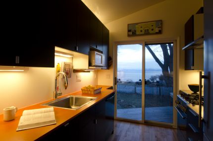
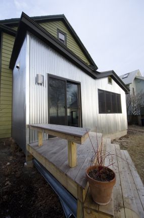
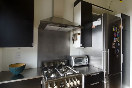
Just take a look at my kitchen. Eighty square feet of…wow! …
Is it the view? Is it the “butterfly ceiling ? The lighting designed by Naomi Miller? The simple palette of white, black and a dash of paprika? Or is it the practical convenience that puts everything a good cook needs within a pivot’s distance from anywhere in the room?
Whatever it is, visitors are immediately drawn to the room despite the fact that it was specifically designed for one person or two, max. It’s tininess allows my guests to be with me without being underfoot while I prep meals. They can visit just as intimately from the living room inside or the deck outside.
See more at www.finehomebuilding.com